Context
A ground-up rebrand of gothicmoon.studio — logo, visual language, copy, and site structure — built to reflect the full scope of the studio's UX and product design practice. Brand identity by Anchovies.
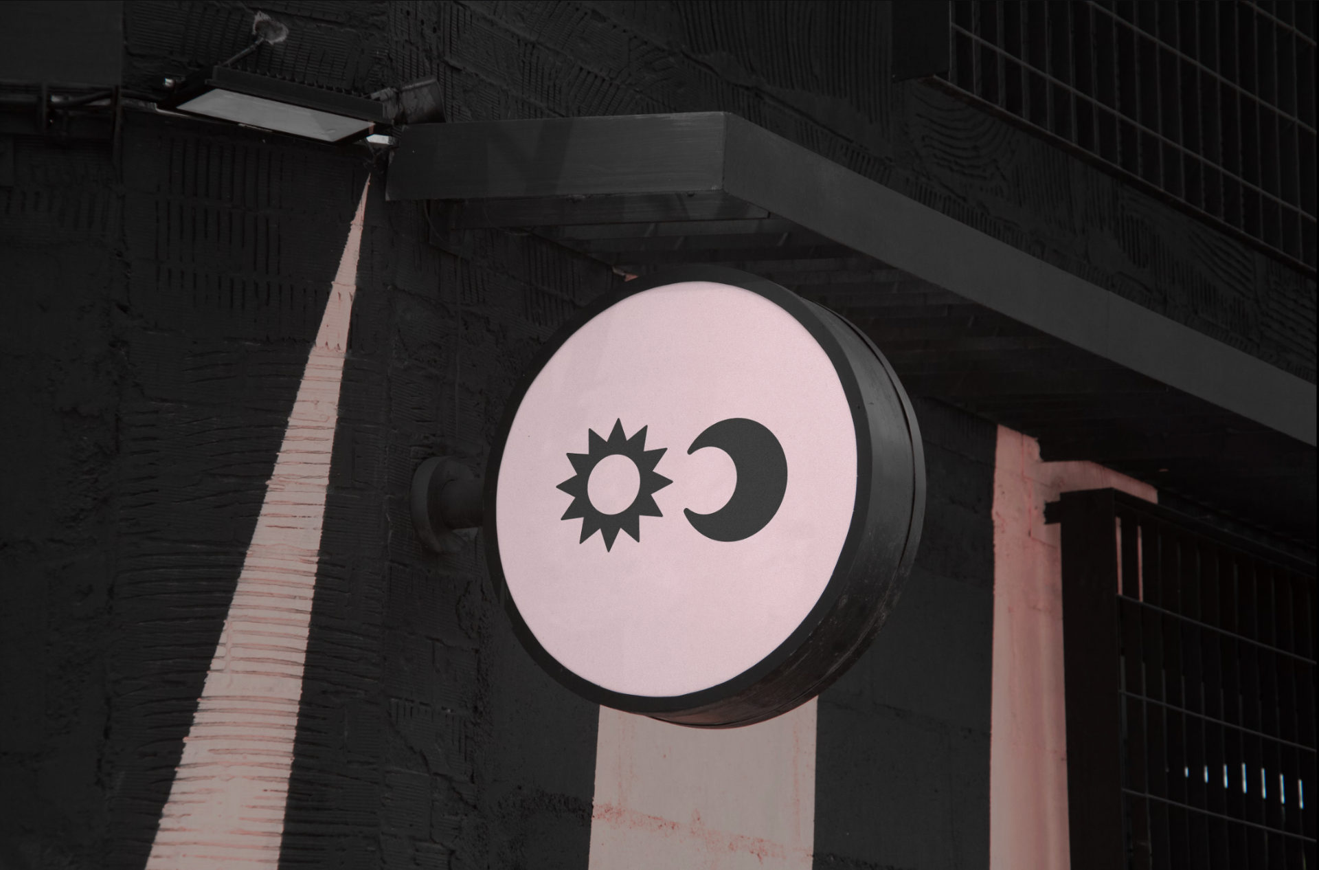
Signage, the mark in the wild.
Brand mark, in motion.
Website, in scroll.
“Gothic Moon is a UI and UX design studio that creates systems that feel like magic, using a ritualized process to reveal what's already there, for founders who believe in alignment.”
Problem
Upon launch, the studio started without a defined brand. The priority was to clarify the mission and understand what kind of clients the work would attract before committing to an identity.
Process
Working with Anchovies, research spanned the occult, alchemy, and early web UI. Brand goals were defined, visual motifs established, and the studio's world was built through many rounds of iteration before the final identity landed.
Outcome
A logo, brand identity, and world built on a magic system — eccentric and well-crafted, designed to hold the many challenges the field demands. The website communicates value, process, and approach, carefully unveiling the foundations: the ritual, the spell, the system.
Credits
End of case study
Back to Work ↗︎